“Colour is the place where our brain and the universe meet".”
Paul Klee
Flicking through a copy of John Pawson’s Spectrum and feeling inspired, I thought it would be interesting to similarly explore a range of colours that catch our attention during our ordinary lives through fun collections of photos from our archives and those of our readers and friends, too.
Yellow seemed as good a place as any to begin.
In colour theory, yellow is energising and is associated with happiness. Less positive is its association with cowardice. Recently, I’ve noticed that yellow is a regular corporate colour as it’s often featured in logos. Yellow, it seems, as well as being an eye-catcher is also associated with modernity.
Bow, London
Hackney Wick, London
Hackney Wick, London
Koenji, Tokyo
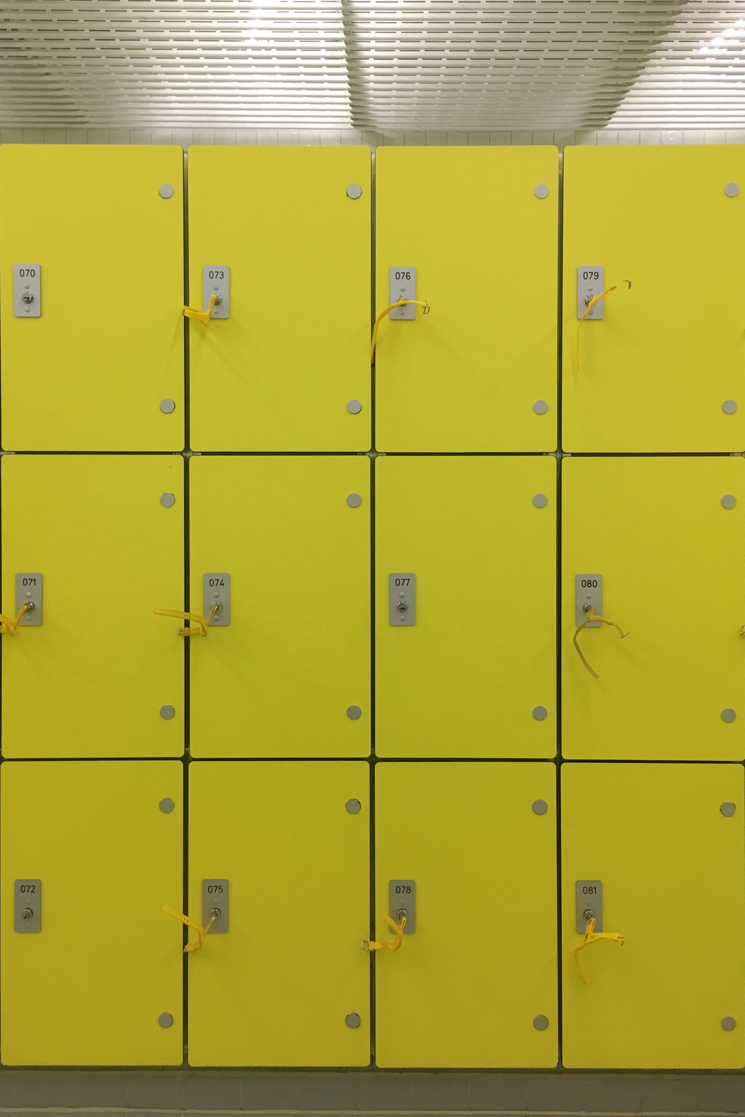
Aquatic Centre, London
Nezu, Tokyo
Daita, Tokyo
Poplar, London
What our friends and followers have noticed:
We have the most loveliest of supporters of Super Ordinary Life. Awesome observers such as Bloomzy and Buckets & Spades who keep thinking of all things Super Ordinary even when they are on their adventures. Mat is especially enthusiastic about the colour Yellow and we now have a neat pile of photos from him ready for our next visit to the colour. Our new contributor this week is @bpdraguiskyphoto who found us via Twitter.
Tile details Noticed in Stockholm by Emma from Bloomzy
Credit: Bloomzy
A collection of yellow things noticed by Mat from Buckets & Spades blog
“I never really look out for themes of colours, I just seem to notice it after it’s happened. I’m drawn to a bunch of different shades, brightnesses and combos, but one reoccurring theme as I look through my cameras, is the colour yellow. Maybe it’s because I associate it with positivity (on a subconscious level), and maybe also because it’s just really jolly looking isn’t it?
It’s used as a warning, friendly reminder, to evoke the summer, to grab your attention, but in the right setting it just blends in with the rest. Yellow, my versatile friend, you are mega.”
I hope you’ve enjoyed this wander through some yellow observations.
If you would like to get involved in the next colour round-up (It will be MINT GREEN), please send your pictures and friendly words to : Yasumi @ superordinarylife (.) com
Thank you!


