“Colors, like features, follow the changes of the emotions.”
Pablo Picasso
Our next whirl into the colour spectrum plunges us into pursuit of hues of fresh mint. That pastelicious milky green goodness.
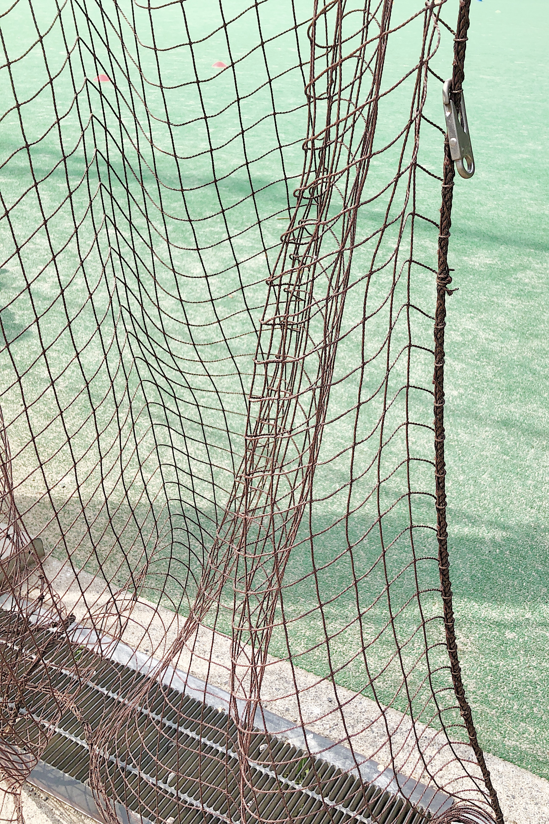
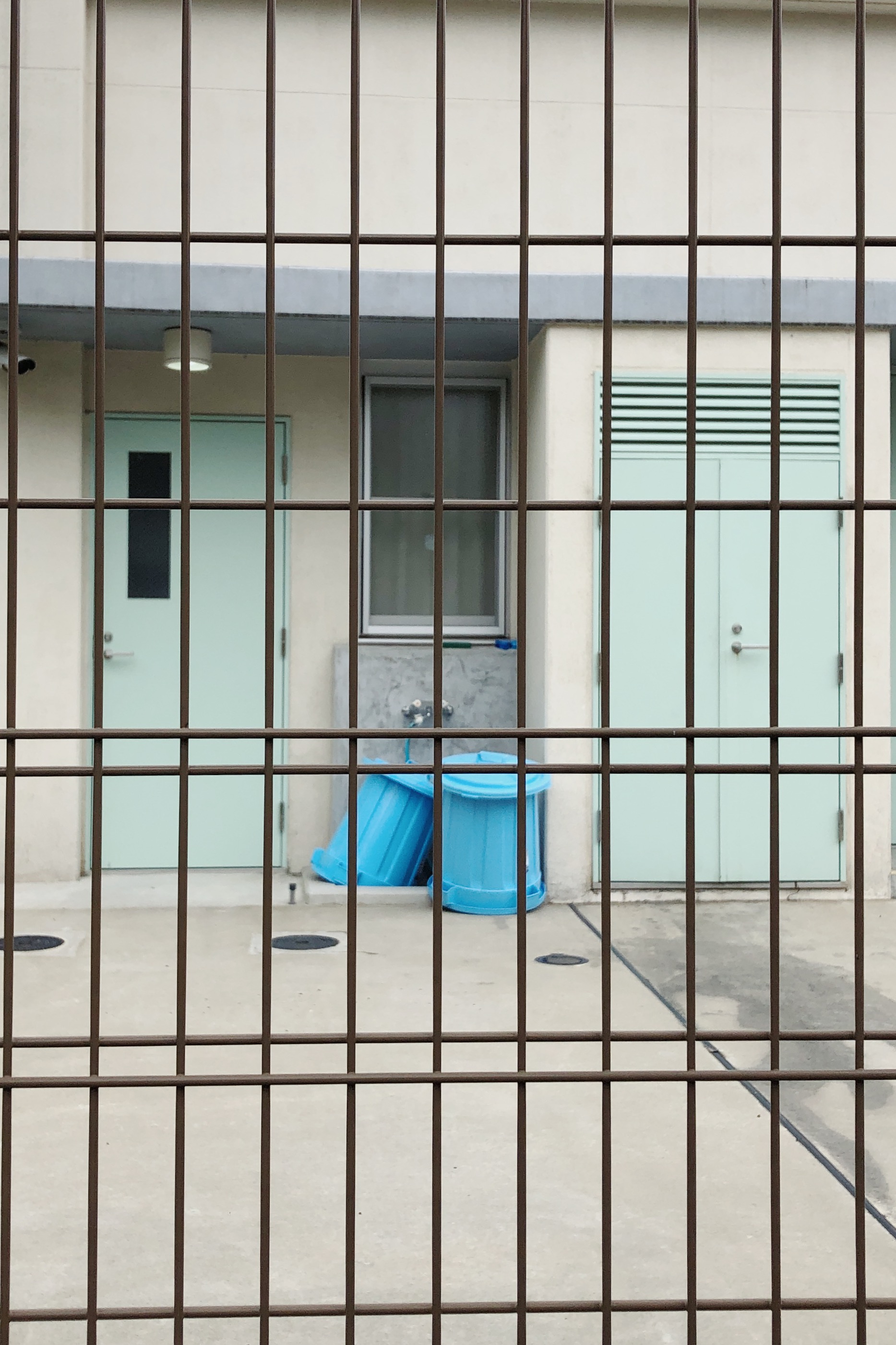
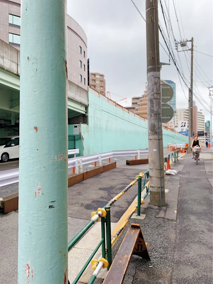
Mint is a colour with tones of appeal to me. Seeing bits of mint in cities is somehow visually refreshing. Since moving to Tokyo I’ve noticed that it’s used A LOT in public spaces. I have no idea why, my father-in-law theorises that Japanese people use mint green as well as other pastel colours in the public realm because they are easy on the eye and less likely to cause any offence. Sort of striking but in a soft way.
Kaguyama, Tokyo
Kaguyama, Tokyo
Yakumo, Tokyo
Yoyogi kōen, Tokyo
Taishido, Tokyo
Kichijōji, Tokyo
Yoyogi Uehara, Tokyo
Futakotamagawa, Tokyo
Umegaoka, Tokyo
In Japan, household bleach comes in mint bottles with pink caps. I’ve also noticed this colour combination on small scale construction and renovation sites.
Sasazuka, Tokyo
Shibuya, Tokyo
Shibuya, Tokyo
Shibuya, Tokyo
Shibuya, Tokyo
Shibuya, Tokyo
What our friends and followers have noticed:
Many thanks to our generous and all-round awesome observers such as Alicia Mundy, Winnie Nip, Susanne from Hallo.Hello.moshimoshi and Mark Bessoudo. It’s an enormous honour and pleasure to have your noticings on our blog.
Hints of mint noticed by Alicia Mundy
“I think mint is just a really soothing colour and I love mint flavoured things, particularly ice cream.”
Website: https://www.aliciamundy.com
Instagram: instagram.com/alicia.mundy
Hastings, UK
Credit: instagram.com/alicia.mundy
Cambridge, UK
Credit: instagram.com/alicia.mundy
Noticed by Winnie from Diamond Canopy
Instagram: https://www.instagram.com/diamondcanopy/
Jewellery Quarter, Birmingham, UK
Noticed by Susanne from Hallo.hello.moshimoshi
Setagaya, Tokyo
Cambodia
Credit : https://markbessoudo.com
Oaxaca, Mexico
Credit : https://markbessoudo.com
Bangkok, Thailand
Credit : https://markbessoudo.com
Do you like mint hues, too?
If you would like to add your pics (and links) to next colour round-up (It will be ORANGE), please send your pictures and friendly words to : Yasumi @ superordinarylife (.) com
Thank you!


